Abstract
In February of 2022, I took the first step into learning UX Design - Enrolling for Google’s 7-course, 30+ week UX Design Specialization and starting work on my first comprehensive design project.
The design prompt I received was for that of a mobile ordering app for a cafe. The target audience being coffee-lovers such as myself, I wanted to address the needs and pain points that I and countless others have encountered while meeting the aesthetic standards that are expected of a great cafe - Cold brew in hand, smooth jazz playing softly overhead.
As the assignments were all individual, I played the part of designer, researcher, interaction designer etc - all in sequence. The perfect starting gig to become an entry-level generalist.
Initial Research
Interviews
At the discovery phase of my project, I conducted user interviews in order to get a better understanding of the problems customers face when ordering at cafes, whether that be in the traditional method or through an ordering app. An important consideration I wished to make was the overall impact these inconveniences can have on the remainder of a user’s daily routine.
I interviewed 6 participants, ranging from students to working professionals, and including multiple ethnicities, income range and native languages. What I was most curious about in these interviews was the way an individual’s routine, responsibilities and personal needs can shape their demands from a mobile ordering application. By inquiring about common frustrations they face while ordering, features they believe would make their lives easier (no matter how unrealistic or far-fetched), and what they enjoyed about any particular ordering experience, I gathered the following insights:
- Users on a tighter budget, such as students, greatly appreciate ease and clarity in bill-sharing/splitting.
- Users on tight schedules and short breaks in which to visit their favorite cafe would much rather skip a lengthy registration process, or to wait in line to explain their customization to the baristas.
- Language barriers, although rare, do arise when limited to a single English menu, and mobile ordering apps have great potential for implementing multi-lingual support.
Reviewing the responses of interview participants, I had a new desire to address budgeting and time-management more effectively by building a design that leaves no ambiguity in terms of a customer’s individual spending - even in groups, and one that takes the least amount of time possible to painlessly order a perfectly customized coffee.
Personas
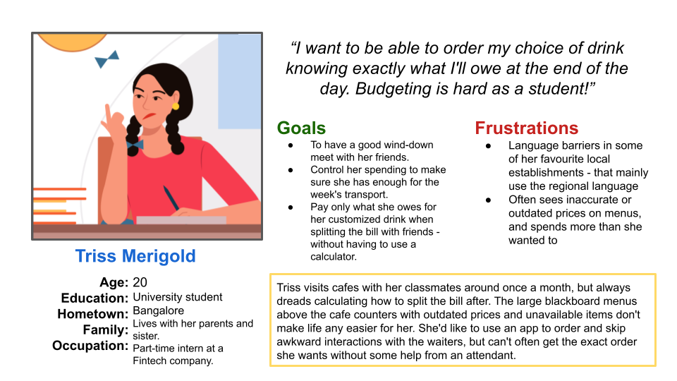 Triss Merigold
Triss is a university student living away from home, and on a tight budget. Her coffee and daily bus unfortunately come out of the same weekly budget, and so when she does go out for the occasional coffee with friends, she needs to be sure she’s not overspending. Go Dutch or go home - Triss absolutely cannot pay for more than what she ordered for herself, and hidden taxes & charges only serve to make her day worse, leaving her with a final bill exceeding what she initially thought she was spending.
 Rohan Chetan
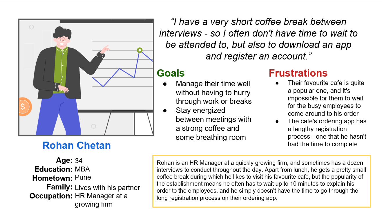
Rohan is an extremely busy HR manager with a short break in which he wants to wind down with his favorite personalized coffee. Unfortunately for him, his cafe of choice is always teeming with customers just like him, and there’s no hope in waiting for the barista to take his order. The online ordering app isn’t being of much use to Rohan either, since he never has the time to finish the lengthy sign-up process. He needs an intuitive and efficient solution that’ll turn his 15 minutes of frantic waiting, to a relaxing coffee break.
Design
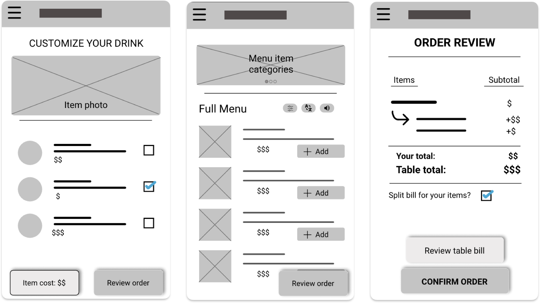
Wireframes
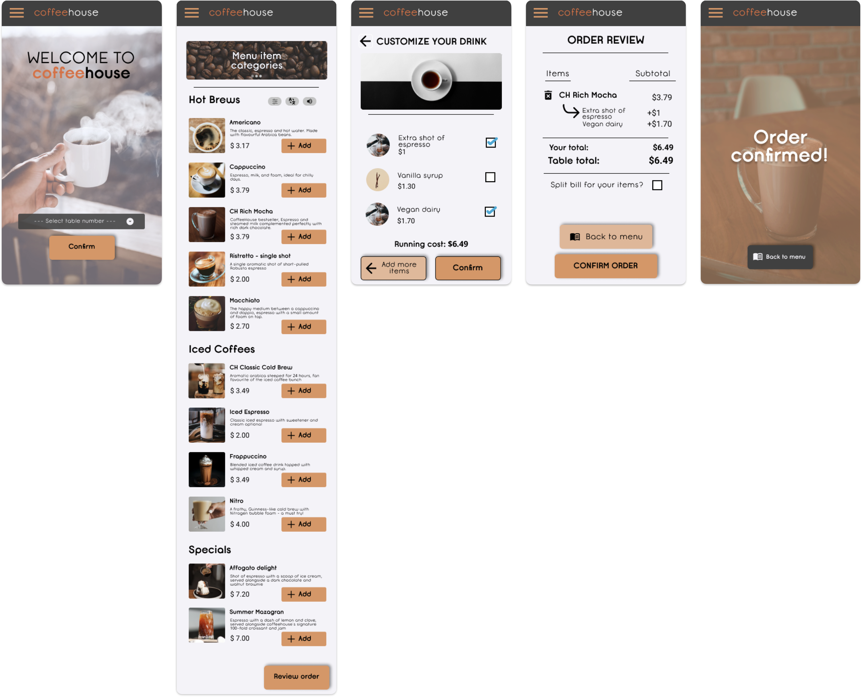
I started with simple paper wireframes and then translated those into low-fidelity digital wireframes. These wireframes were also used to make the first low-fidelity prototypes to be used in the first usability study. Towards the closing stages of the design process, high-fidelity mockups and prototypes were made for a second usability test.
User Testing
Before finalizing the design, I did a testing round in order to reveal possible usability problems.
Although I wasn’t able to perform very extensive tests on a large group, I did receive encouraging feedback in the few tests I conducted amongst my peers. First, my efforts to clear up any ambiguity or uncertainty in the user flow seemed to effectively clean up the user experience when compared to the feedback from my initial wireframes. By using simple, clear and communicative calls to action, most button and navigation elements seemed to convey their purpose well and the users did not require any guesswork or help to get around the app. Furthermore, addressing the pain point of hidden or unexplained charges prior to payment also seemed to significantly improve the feedback from users on the app.
The more frugal user segment, such as university or high school students, were very receptive to the bill splitting feature at the order confirmation stage, which was a key pain point I recognized during my first interviews with users of a similar age group.
Finally, those of the users who were frequent coffee drinkers at popular coffee chains such as Starbucks or Third Wave Coffee, seemed to appreciate the extensive in-app customization screen, as such a feature was missing or limited from the aforementioned chains’ ordering methods.
Takeaways
As my first comprehensive User Experience Design project, I was going into this quite ‘blind’. I didn’t know what considerations to make, how to optimize and focus my research, and the best way to address any one particular pain-point. But alongside the great tutors and course material in Google’s UX Specialization courses with Coursera, I learned many things.
Accessibility in particular, was one aspect that I almost completely disregarded in my initial ideas for the app. Learning more about the various challenges faced by users with disabilities, and all the simple, yet effective ways of addressing them - was perhaps one of the most influential portions of the course for me. I’ll be sure to account for accessibility in all my future designs.
The UX Research process also was one of the most engaging portions of the process, as I learned so much about connecting with the userbase, gathering and understanding feedback, and making the best design decisions with the user research in mind.
\\\\\\\\\\\\\\\\\\\\\\\\\\\\\\\\\\\\\\\\\\\\\\\\\\\\\\\\\\\\\\\\\\\\